Scott Palmer Sound, Inc | Business Cards
Thursday | April 26, 2012
© Stefanie Kljucaric All Rights Reserved
—
About two weeks ago, I received an email from a friend inquiring about having some business cards done (or re-done). Wanting to design ALL the things made me really excited to be able to create them for Scott, a sound engineer and longtime friend.
We had talked about the possibility briefly over dinner weeks prior to that. Basically, he had a composition made by a different artist a while ago that he wasn’t quite happy with. He said he was having trouble getting in touch with that artist to make changes so I said I would love the opportunity to make him love his business cards.
So when I received the email, it came with a few basic instructions as well as the original compositions (which I don’t want to post here since I don’t know if the original artist would be cool with that). I was asked to re-do the font which was a fancy, calligraphy font used throughout the card. In addition, I was asked to leave the back side which featured a stock image of headphones well enough alone since he was already happy with that. Finally, being a sound engineer, he asked that I include a sound wave somewhere on the card.
I promised three compositions to choose from and delivered – all within 24 hours. All three were created at 300 DPI, CMYK color with a white back side and enough space to be writable.
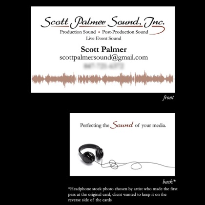
- The first version is the closest to the original compositions I was given. I took out the calligraphy font for the body of the card, but created an interesting calligraphy-ish header. The original featured a waveform that looked screen grabbed by screenshotting a program like Audacity, so it was a little rough around the edges. I took it into Illustrator and cleaned it up with a quick & easy live trace. I left the back side completely alone except for re-writing the tag line in the new font, and moving it out of it’s original spot in the middle of the card to allow for more writing room.
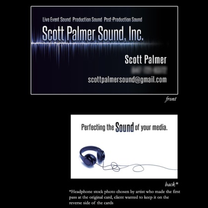
- The second version was my stab at an all black front card. I think black cards can look edgy while looking professional, my personal card is mostly black on the front. Created a waveform in Photoshop, adjusted text to match on the front & back, and it’s good to go.
- The third version is by far my favorite. I love high-contrast black and white so that could have something to do with it. Created the abstract waveform, chose another new font, and created a completely different back side for the sake of trying something new.
As of right now, Scott is still choosing which card he’d like to use so they haven’t been printed yet. I was just so excited, after obtaining his permission of course, to be able to share these. He seemed very happy with the results, so I’m happy too. I’ll update once he picks his favorite here and on my website.
I LOVE branding and business card design so this was a great break from the city illustration (it’s STILL happening, I promise!)
And if you need a sound engineer – definitely hit up Scott. He’s a pretty swell guy!
UPDATE: Scott chose a comp and had the cards printed! See the finished product here.


Thursday | October 4, 2012 at 8:50 pm
[…] a few months ago I made a post about designing business cards for my friend’s sound company. He recently chose one of the three comps I created, we made a […]